Table of Contents
Introduction
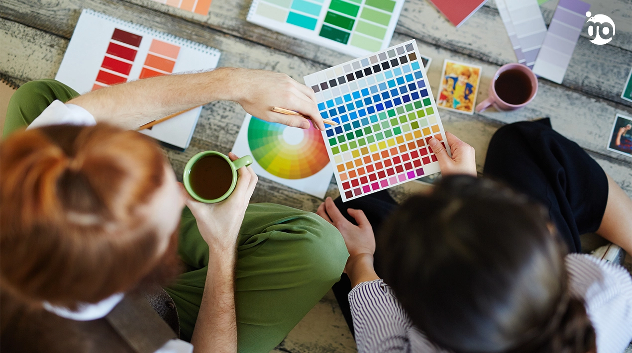
In graphic design, colour and the psychology of colour perception are essential components. Here are some examples of how colour and psychology impact the process of graphic design. The study of colour’s influence on human emotions and behavior is known as colour psychology. Our responses to colour are the result of a multifaceted interplay between our cultural background, our family history, and our individual preferences.
How would you react to a green logo as opposed to a blue one? Although your initial reaction could be that it doesn’t matter, a design’s choice of colour can affect the people who see it. In graphic design, colour is a great technique to subtly affect the viewer’s perception of a composition. Bright green, for instance, is associated with nature and springtime, making it an ideal choice for a logo for a company that provides sustainable energy.
Subtle changes in perception can occur; for instance, colour can intensify or lessen the flavour of food. The appropriate colour can also increase the effectiveness of drugs and placebos; blue is typically used for pills that relax or induce sleep, while red or yellow is typically used for stimulants.
Colour Psychology
The study of how colour influences our feelings and actions is known as colour psychology. Certain colours might evoke particular feelings in you, depending on your upbringing, cultural background, and personal taste.

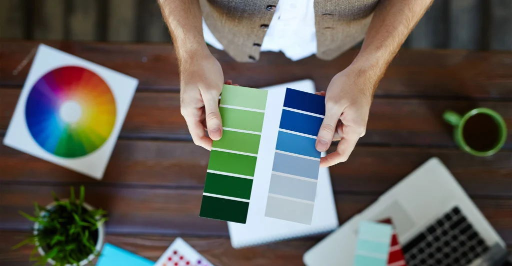
Psychology of Colour Selection
Have you ever noticed how you usually feel happier or brighter in a yellow room? Or how a red sign might warn you of impending danger, while a red outfit can arouse feelings of passion?
Colour and emotions can be very subjective, colour psychology is a somewhat specialized field of study. However, research indicates that colour does have a particular impact on emotion. olour choice is a major factor in creating these feelings. The method of selecting upbeat hues also denotes dependability to make an individual feel comfortable making purchases them a particular product.
The business discovered research suggesting blue is frequently associated with reliability and serenity. To encourage people to identify their brand with happiness, they changed the blue to a brighter shade. It’s also critical to understand that, depending on the culture, different colours can elicit different feelings. For instance, red typically connotes luck or happiness in Eastern cultures, but danger, passion, or fury in Western societies. China views blue as feminine, but the United States views it as manly.
The choice of colours you use can have a significant effect on how your audience responds to and perceives your offering. It has the power to arouse enthusiasm or calmness, as well as hunger and trust. For this reason, each hue should be carefully chosen to support the piece’s overall objectives.
Red Colour
Pink Colour
Orange Colour
Yellow Colour
Although yellow is a generally happy and warm colour, it has also been shown to elicit annoyance and rage. Since yellow is the most striking colour, it’s frequently used in advertisements to grab the viewer’s attention or to call attention to traffic signs.
Conclusion
Choosing visually appealing colour combinations is just one aspect of graphic design. A graphic designer’s profession includes more than just carefully selecting colours to achieve desired results. This means that a key element of effective graphic design is having a thorough understanding of colour psychology and knowing when and how to utilize each hue wisely.
Frequently Asked Questions
The study of how colour influences our feelings and actions is known as colour psychology. Certain colours might evoke particular feelings in you, depending on your upbringing, cultural background, and personal taste.
Colour is important in graphic design. It is capable of conveying information without the use of words. Colours influence our vision in different ways, depending on how our gender, cultural identity, personal preferences, and family history interact.
According to research navy blue is the world’s most tranquil colour.